In our multi-part part Bricks Builder Tutorial about CSS Grid, we will deep dive into all relevant aspects of CSS Grid in Bricks builder and by the end of it you will be able to utilize our framework to create fully responsive layouts by just adding a few different classes to your container elements.
CSS Grid is the newest and easiest way to create responsive layouts in Bricks Builder. The Bricks Team has announced that they will make grid a native component in their builder, however, assuming it'll be similar to Oxygen's grid component, it is quite cumbersome to continually add your layout instead of just adding classes on the fly.
Put simply, CSS Grid allows you to create flexible, dynamic, and attractive layouts. It works hand-in-hand with flexbox to give you complete control of your website's design.
CSS Grid Layout excels at dividing a page into major regions or defining the relationship in terms of size, position, and layer, between parts of a control built from HTML primitives.
Like tables, grid layout enables an author to align elements into columns and rows. However, many more layouts are either possible or easier with CSS grid than they were with tables. For example, a grid container's child elements could position themselves so they actually overlap and layer, similar to CSS positioned elements.Mozilla Web Docs
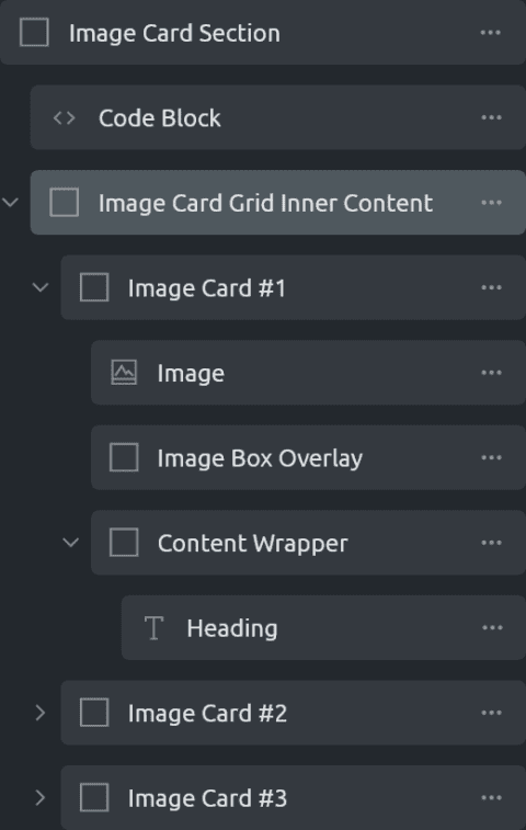
In this tutorial, we are going to show you how you properly create image cards in Bricks Builder. This concept applies far beyond the scope of just image cards and can be used for background images, call to actions, and much more.
It is a rather simple process to make these image cards, the only issue is that Bricks adds a few extra wrappers that we need to manipulate to suit our needs. Once you get the hang of it, you can begin to apply it to everything and utilize all the benefits of using an image instead of a background image. Here is the basic structure:
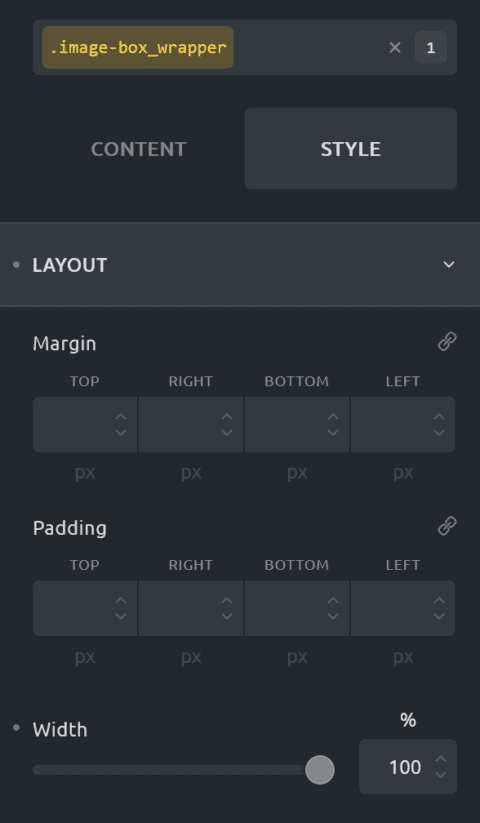
To get started we simply created a section and an inner grid with 3 columns. Inside each column, we insert a div (or a container). Add a class of .image-box_wrapper and set the width to 100% and add the following code to the CSS. You can change the height to whatever you want.
root{
height: 45rem;
}Then we add an image inside the container, add the class .image-box_image and make both the width & height to 100% and add the following code inside the CSS code editor.
root{
height: 100%;
transition: .3s transform ease-in-out;
}
The transition is used later in the tutorial for when we add hover effects, but for simplicity just add it now.
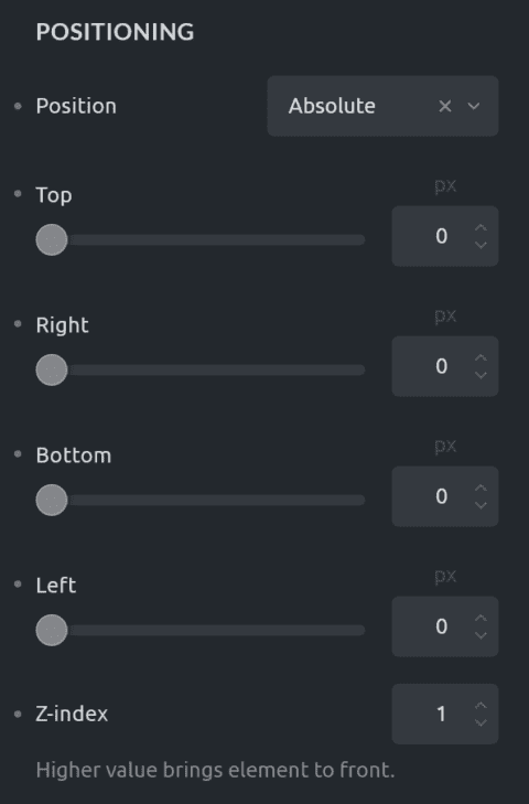
Next, you'll add another div add the class .image-box_overlay, set the position to absolute with a top, bottom, left, and right to 0 and a z-index of 1.
Now navigate to the gradient/overlay tab pick your colors and set the "Apply To" to the background.
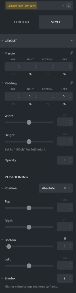
Add another div inside the parent, not the overlay div. Set its position to absolute with a bottom of 5% and padding on the left & right with 5%
root{
transition: .3s transform ease-in-out;
}Because of the way that Bricks loads the content on the front-end, additional divs are added. We need to add additional CSS to ensure that all the components work properly. If you followed along and added the same classes stated in each step you can copy & paste this into a code block and everything should work perfectly.
<style>
.image-box_image {
  height: 100%;
}

.image-box_image > .image-wrapper {
  height: 100%;
}

.image-box_image > .image-wrapper > img {
  object-fit: cover;
}

.bricks-element-inner > .image-wrapper > img {
  object-fit: cover;
}

.bricks-element-inner {
  height: 100%;
}

.bricks-element-inner > .image-wrapper {
  height: 100%;
}

.image-box_wrapper {
  overflow: hidden;
}

.image-box_wrapper:hover .image-box_image {
  transform: scale(1.1);
}

.image-box_wrapper:hover .image-box_content {
  transform: translateY(-25%);
}
</style>